Monday, April 30, 2012
Web Hosting
Website are distributed via the World Wide Web, companies producing the websites will often pay host companies to store the website on their files, when I researched this I found that this could cost anywhere from free to over £100 a month.
One of the most important factors of distributing your website is the domain name, by choosing a name that contains words which are highly searched on search engines the chances of the website being seen is then increased. But these cannot just be any words they must link together with your website/company.
I can register my domain name with many different companies most of these companies offer very similar service but differ in price. I would like to publish my website using Apache. Apache is a public-domain open source Web server software which is maintained by a group of programmers. Apache started in 1995 and by 2009 it was the first sever to go past the 100 million mark. I chose this server because when I did research I found that it was a very commonly used server and a very high reputation.
I will put my website on Google as it is the leading search engine and by using Google I am almost guaranteed traffic to my site. To make my website even more visible I could use
‘http://google.advertisingwebservice.co.uk/awsmhowitworks.aspx?cid=532&gclid=CKro6p_R1qgCFUdP4QodzhnoAA’ by paying £5 a month I will be able to put my website into the ‘ads’ part on the Google page.
Sunday, April 29, 2012
Copyright
Here I have added the copyright information to the bottom of each page this increases the believability and authenticity of the page i used a similar style to that of the one i found on the British Heart Foundation website to make it look more believable. Copyright information is needed on websites to inform people that the content cannot be copied.
Friday, April 27, 2012
Finished site

This is my enter page for our main website with our own animated heart pumping.Made using Final Cut Express. This gives the opening page of my website an individual touch, you wouldn't find this anywhere else. According to some of the audience feedback that I obtained I found that some people found this a bit scary but the majority of people thought it was quite a good idea so I decided to keep it on my website.

This is my get involved page with pictures of our volenteers and information on how to get involved. The Pictures that I used for this page I believe make the page. They show a wide variety of people from different backgrounds and of all ages. This is an important factor because it reinforces the fact that anyone can get involved and help the good cause.

This is my facts and advice page with our home doctor Dr Wells telling us what she believes will help you lead a healthy heart problem free life. This page is more a what YOU can do to help yourself. I included pictures of fruit and a picture of Dr Wells herself. By having a person of authority on my website I believe it helps to ensure that people understand and believe what I say.

This is my donate page. Our donation box is linked to paypal (link below). Donations are key for charities. in order to make people more interested in donating money to my cause I decided to use the image of a money box as from my audience research I found that pictures are more likely to grab attention of people rather than words.

This is the pay pal website where donations can be made.

This is my contact us page with our contact details, and there is an area provided where people can leave comments and feedback. A page for the audience is essential in my view as it allows them to get more involved with the site as a whole.

This is my where does you money go page which shows people where their money goes. By showing people what their money is doing and how it is helping I believe that it makes people more likely to donate money.

This is my research page showing our latest research
breakthroughs, with some of the countries most
tallented and knowledgable research scientists.

This is the my local shops page with information about
our shops and images of our volenteers and our shop.
Thursday, April 26, 2012
Logo Design
During my research phase I became aware that all of these different sites whether it be school or charity have a logo which gives them an identity. In my view this identity is crutial in drawing the attention of the target market. So in order to give my website an individualistic identity I started firstly for a name, this was an easy task as 'Help a Heart' does exactly what it says on the tin. So it conveys the message about what the site is about to the target market. I then had to pic colours. Two colours that seemed to be very obvious were red and blue this is due to the fact that oxygenated blood is red and deoxygenated blood is said to be blue.
 I used photoshop in order to create my logo. I downloaded a free font from 'dafont' which i thought was appropriate. But instead of simply writing help a heart and moving on i decided to create my identity. By adding blue it stands out a bit more and also by swapping the letter 'E' with a heart I believe makes the site seem more 'light-hearted'. the logo seems fun but at the same time serious, i did this purposely to try and make people more willing to talk about such a touchy subject.


This is my final Logo design I am very happy with the way it looks on its own. I believe that it looks very welcoming. The colour red is not just simply the colour of blood but it has many different conotations. Red could signfy love lust passion luck and many other emotions so in my view it is an effective colour to use with such an emotionally connecting subject. Blue is also an emotionally connected colour it is often associated with sadness and bad news. This some would say is a negative input on the website but in my personal view I think that it should be accpeted by everyone that bad things may happen but you are not alone you are surrounded by people filled with the 'red emotions' and that they are around to help.
Music For Help A Heart
In todays lesson I deceided to create the music for my home page of my website because when researching I found out that the public engage and prefer websites that contain some sort of interactivity. In order to make my music I used garage band here I used various instruments to make the music more deep rather than just a single instrument I had to change the pitches of some instruments and also the sound levels.

For my enter page I wanted to make a beating heart because I believed that this would attract more people to my website as it had something different that no other website had. As I went along I found out that this was not an easy task to fulfil. I started of by finding images of the heart that I liked and I didn’t find to gory. I then put them into final cut express, a software designed to make and edit videos. I decided to set te background the same colour as the background of my website I did this to make sure that the background of the video did not standout from the page too much. I then made the pumping sound of the heart on garage band. I then added my edited heart to the beating sound and the out come of this is the beating heart found on my enter page.
These are the images i used:


This is the images in final cut express:

Wednesday, April 25, 2012
In the lesson...
In today’s lesson I took some photographs using the shot list that I prepared earlier. I also looked through the pictures that I took and selected a few that I believed would suit our website the best. I decided to manipulate these images in photoshop to get rid of any imperfections that I saw, this would then enhance the viewers experience whilst on my site. I also decided to make a template for my main pages as i believe that by using my own template I am creating something unique and different to everyone else and also by using the template across my website I increase the uniformity of my site, making it look more professional.

This is what my template looks like. I have the Logo very big taking up the top pf the page this is to ensure that people are able to connect with my website and become familiar with it. It also creates and indivial identity for my website. Below the name I have a search bar which will allow people to come to my website and search for specific quires. This I believe makes my website more user friendly and makes the lives of my target market easier. Below the search bar I have got the navigation bar which again allows people quick accsess to various parts of the website. I have included small images on the navigation bar to keep the consumer interested.
research
In todays lesson I began researching existing charity websites to understand the typical conventions of websites and what the audience want. I print screened annotated 4 websites 2 pages from all of them using my knowledge and terminology to do so. I started my research which needs to be complete in order to have all the information to create my main site which is based on a heart charity. Because of this I researched into charity websites and compared the techniques and common conventions used to convey information for example the layout, font sizes, photo galleries, and interactive parts. I print screen and annotated some charity websites. By doing this research it has widened my knowledge on normal website conventions for example; I have learnt that colour plays a huge impact on the audiences first impression and too much colour can be distracting to the information needed to be displayed, however in contrast too little colour can make the website seem dull and uninviting. In order to have the information easily read a layout is conventionally with a banner across the top to vertical side bars a larger block in the middle also a navigation bar is used to show each page of the website. Websites conventionally use interactivey to keep the audience enaged with the website and the information being displayed. For instance; -roll overs -links -animation -visual and audio pieces -blogs When creating my main charity website we will follow the typical website conventions as listed above.
here are a few examples that i did :
Media Website Analysis.
here are a few examples that i did :
Tuesday, April 24, 2012
Planning Main site
In today’s lesson I started to design the different pages of my website, by designing my website on paper before using iweb to design it allows us to have a blank canvas on which i can let my creativity take place with out the confusion of how to do things on the computer. Whilst designing I decided that it would be best if kept the toolbars and columns the same but just change the content we decided this to give my website a more uniformed look which in turn will make it look more professional.
This is one of my pages that I drew as a template:
.
 This is a very rough sketch that I did in order for me to be able to visualise what my own website would look like. It dint really give me a great deal of reality but it helped me when i was trying to figure out where i would position various things on my pages. I decided I will create one layout which will be then copied and used for each just edited slightly to fit the requirements for the page however still have the same links thus following the website conventions. I also thought I would use the skills I learnt when creating my preliminary website and decided I will create a enter page using final cut express to show a beating heart to connect with the audience.

.jpg)
This is one of my pages that I drew as a template:
.


.jpg)
Shot list
In today’s lesson I decided to write up a shot list which will contain a list of the pictures that I want to take, the shot list would help me to visualise the images that I want and then go out and take them.
For my main website I have decided to make a campaign site focusing on the issues that arise with heart problems for my website I will be using a variety of audio and visual aids. Images will be a main factor in my site, here is a shot list of some of the pictures I want to take.
I want to take pictures of: A family, and use Photoshop to fade one member of this family out to make it look as if one member has passed away due to a heart complication and that we as a charity are trying to raise awareness about these heart problems ands ways of which they may be prevented.
Someone at the gym or exercising in some way. This will again emphasise the prevention of heart problems. We would also like to have an image of a person eating a healthy balanced diet as this is key to prevention of not just heart problems but a wide variety of other problems as well.
A science lab - where our researchers will be working using the donations and aids provided by the public to try and find new life changing drugs and treatment for heart patients.
shop – to show the wide variety of ways in which people can donate, money, clothes, brick-a-brack, cds, videos and dvds.
Cake sale – the cake sale is just one of the appeals that school children nation wide have done in order to raise money for the ‘Help a Heart foundation’s’ get involved appeal.
I also need to take pictures of people who are suitable to be in various positions in mycharity. For example I need people who look like top end ceo’s and also people who could be working as volunteers for our shops.
I believe that by using a shot list it gives us a chance to plan what exactly I want to do before I do it. This will intern allow me to visualise what I really want my website to look like and include. So the website is going to be a direct representation of my own thoughts and ideas strung together with the use of planning and clever manipulation of well photographed images using Photoshop.
Survey
In today’s lesson i decided to create a survey that we would send out to a variety of different demographic audiences. I believe that by creating a survey I will then be able to provide a service that people would appreciate. The survey would give me an idea of what kind of information, layout, images and interactive services that my target audience would like to and expect to receive from the website. this is what our survey looked like...
.


The last page of my survey is very important as it gives my target market a chance to put forward ideas that I may have missed out.

Starting Main Website..
In today's lesson I planned what I wanted my final website to be about. I briefly brainstormed the needs for my campaign website and created a brief. Here below is my brief..
I are going to create a campaign website for a heart charity informing others about the dangers of heart disease and how to prevent heart complications. In order to complete this task I will make 8 pages These pages will be the following;
1. Homepage
2. Facts and advice
3. Recent Events
4. How to get involved
5. Where does your money go?
6. Appeal Pack
7. About us
8. Donate
9. Need help?
I will create a standard layout which will be used on all 8 pages, this will make sure the information is presented and aligned correctly allowing the audience to use my website with ease. To display each link on my website we will use a navigation bar and use the typical website conventions for example a banner across the top two vertical side bars amid larger block in the middle. My website will include the following;
- sound
- video
- written text
- images
I will also make sure our website uses interactivity to keep the audience engaged for example;
- rollovers
- links
- social networking/blogs
I started my research which needs to be complete in order to have all the information to create my main site which is based on a heart charity. Because of this we researched into charity websites and compared the techniques and common conventions used to convey information for example the layout, font sizes, photo galleries, and interactive parts. I print screen and annotated some charity websites. By doing this research it has widened my knowledge on normal website conventions for example; I have learnt that colour plays a huge impact on the audiences first impression and too much colour can be distracting to the information needed to be displayed, however in contrast too little colour can make the website seem dull and uninviting. In order to have the information easily read a layout is conventionally with a banner across the top to vertical side bars a larger block in the middle also a navigation bar is used to show each page of the website. Websites conventionally use interactivey to keep the audience enaged with the website and the information being displayed. For instance; -roll overs -links -animation -visual and audio pieces -blogs When creating my main charity website we will follow the typical website conventions as listed above
Final School Site.
This is the fimal product of my school website I have print screened all 3 pages.

This is the Logo for my school website. I have chosen to use blue and orange as they are the colours I have chosen for my school. I like this as a logo as in my view it is quite a 'fun' logo where as normally you would expect a schools logo to be quite boring.
 This is the main homepage of my school website. I have used vibrant colours and images to grab the attention of the students and parent that visit the school website. The subjects tab is linked to the subjects page below. I believe that by having the picture as the background it gives the website more of a natural feel as that is what the school looks like so when people enter the site they are met with a familiar site.

This is the subjects page which cotains all of the different subjects that are available at my school. In my view this page is a relatively easy page to navigate around. you just need to click on which ever link you require and then you will be taken to the page you want.
 This is the media page of my website. I believe that i should have arranged the web page better as it all looks cluttered and as its the media page in theory you would expect it to be one of the best pages. I think that some of my photography could be improved, also i think that the frame around the text box makes the site seem a little bit amateur.

This is the Logo for my school website. I have chosen to use blue and orange as they are the colours I have chosen for my school. I like this as a logo as in my view it is quite a 'fun' logo where as normally you would expect a schools logo to be quite boring.


This is the subjects page which cotains all of the different subjects that are available at my school. In my view this page is a relatively easy page to navigate around. you just need to click on which ever link you require and then you will be taken to the page you want.

Video
In todays lesson we were grouped into groups of 4 so we could film our video needed for our websites, myself and my group decided to film various locations around the school collecting enough material to edit and produce a short video needed to complete my website. I then began to edit the video on final cut express to tidy it up and make it complete for my website.
Photo shoot & Minor Edits.
In todays lesson i looked at the images that I took previously and began editing them in photoshop using the tools i learnt at the start of the course. Mainly I found i had to straighten the images to ensure they wer 100% straight and crop any unwanted background noise. I then often changed the levels of saturation, hue and brightness as this little change can do alot to a image. With a few of my images i did have to use the clone tool as i had to fade out the image of the Ravenswood badge on the school boys blazer's.
Here below our my finished edited images that i will use for my website:
 This is an image I took of some school children sitting down enjoying their lunch I believe that this could be an effective tool on my scholl website as it shows that the children are happy and parents sending their children to any school would want to make sure that their children are going to be happy.
 This is a picture of the school canteen here we can see food which looks relatively healthy. Again this would incourage parents to send their children to this school.
 This is a picture of the media department apple mac computers, I have taken these in order to promote the media departments state of the art equipment and as in the picture there is more than one it shows that it can cater for many students.
 PE is a very important lesson to many people due to recent increases in child obesity and other health related illnesses so by using images where the children are active and getting involved it gives parents an idea that their child will be more healthy.

The trophy cabinate is an extremely important picture i believe as it sings the success of the school and again acts as a sale point for parents. 'If your child comes here he will leave a winner'.
Here below our my finished edited images that i will use for my website:
The trophy cabinate is an extremely important picture i believe as it sings the success of the school and again acts as a sale point for parents. 'If your child comes here he will leave a winner'.
Slideshow

In today's lesson I started to create a slide show of images that I had taken from around my school in order to give my school site a sense of reality. I used iphoto on the apple mac computers. I decided to make a slideshow of images due to the fact that when I did my market research I found that moving images engage the audience more than just plane text and images.
Starting My Website
When starting my website I used iweb on the apple mac computers. I found this quite challenging as i hadn't had much previous experience with macs. in order for me to be able to learn quickly how to use them I used online tutorials on websites such as youtube. As i didn't have much i dea of what i was doing I decided to draw my site out on paper so i could visualise it and then work out how to make my thoughts and ideas into a website. This is what I proposed as my preliminary website.


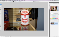
Money box edited in photoshop
In todays lesson I decided to edit my money box for my ‘donate’ page. I have planned to link this box to the paypal website enabling people to pay directly to the charity via paypal. For the donation box I took a picture of one in the British Heart Foundation. I needed to edit the logo out and make it look presentable. I did this by using the clone tool, editing the brightness and also the contrast for this I used photoshop.
This is the original image:

This is the image cropped down in photoshop:
 .
.
I then had to zoom in in order to get a clearer view of what I needed to do:

This is the final image fully edited:

Saturday, April 21, 2012
Audience Research
Who is my target market for my preliminary task?
The target market for my school website is parents with children aged 11+ looking to join my school and for parents of students who attend the school already and also the students themselves. The people my site is aimed at will be from all demo In order to gain a bit of background information on my target audience I have sent out a survey to people of all demographic backgrounds.
This is the full set of results that I attained from these results i am able to see what would me most favored by my target audience for my website. By following the information I obtained by my website I will able to ensure that my target will be more likely to visit my site.
Friday, April 20, 2012
Reflection
Now I have the task of choosing what my own website is going to look like. In order to this I sat down and made a few sketches firstly of different colours that I wanted to represent my school and then of the lay out of my website this is the layout that I chosen for my website. This is the final sketch that I made.
The colors I have chosen to use are light blue and orange I chose these colors as they are not generally associated with schools which would hopefully mean that people would always remember my website and my school. my school embalm will be in the top left of the page following the normal conventions of a school website.
The colors I have chosen to use are light blue and orange I chose these colors as they are not generally associated with schools which would hopefully mean that people would always remember my website and my school. my school embalm will be in the top left of the page following the normal conventions of a school website.
Key Findings
As research for my school website I went on 6 different school websites and analysed them I used 5 secondary schools and 1 primary school. I found that there were more colours on the primary school website where as the secondary school websites tend to have 1 or 2 colours which give them a more uniformed and executive look. All of the school websites followed the same kind of structure whereby the school emblem is in the top left hand side of the page, followed by the school’s name. There are normally two columns on either side where links and other information are placed. Somewhere on the page there is always a head teacher’s column which has a short letter from the head teacher which invites parents and children to the page and explains a bit about the school and its values and aims for the future. In order to make it easier to access information that you require on the websites there is a navigation bar on the navigation bars there are different rollovers such as ‘contact us’ or ‘about us’. Most of the websites have images of students and teachers doing various activities.
For my website i will be following all of the conventions I mentioned above. My website however will contain a short video clip of an aspect of the school in action. I will edit this video using final cut express, on the apple macs. There will be various rollovers on the page which will take to you different parts of my schools website. all images that i use on my website will be my own images and most will be manipulated on photoshop.
Research
This is the research I did to find out the key conventions of a school website. I looked at many different websites and labeled various aspects: such as sidebars, logos and images. The reason I looked at more than one website is to find out the similarities and differences,why they have been used and what effect they have.
 This is my analysis of the Hayes Secondary School website. I have annotated the main home page. I believe that this website looks professional due to the colour scheme that is used. By using the same shade of blue across the site it gives the site a sense of uniformity and this in turn makes the school seem more organised and would persuade parents to send their children to this school. The school also has a video roll of the schools success which again will give a good overview of the school as a first impression to parents and other visitors to the website.
ADDD MORE EXAMPLES HERREEE!!!

ADDD MORE EXAMPLES HERREEE!!!
Preliminary Task
As my media as level coursework I have been asked to design and produce a school website using Iweb. The website should consist of 2 pages with one of these being a linked fully functioning page. For my website I will be using pictures that I have taken and manipulated my self using adobe Photoshop. I will have to conduct my own research through which I will be able to find out the typical conventions that are used for school websites. I will have to follow these conventions to make my website believable and after I have completed my website I will evaluate it to see how effective I have been.
I will be following the standard conventions of a school website using colours that complement each other and are bright but not too bright. the colors I have chosen to use are light blue and orange i chose these colors as they are not generally associated with schools which would hopefully mean that people would always remember my website and my school. my school embalm will be in the top left of the page following the normal conventions of a school website.
Thursday, April 19, 2012
Iweb
In todays lesson we learnt how to use a new program called 'iWeb'. This the program we will use to create our preliminary website and then our main website. We began to experiment with the different tools on 'iWeb' for example the inspector tool. This gave us an quick insight to the work that we will be completing in the weeks ahead.
Here is an image of the inspector tool


Wednesday, April 18, 2012
Experimenting with camera and photoshop
In todays lesson we were all separated into groups and each group was given a camera. With this camera came a task, we had to take two photos, one serious formal image and one happy crazy image. When taking the images we had to follow the rules of media for example; the rules of thirds and the distance between the camera and focus point and the position of the camera.
Here is one of the images we took:

we were introduced to photo shop and how you can manipulate a image to your advantage. We were given a basic over view on how to upload images, create layers, and improve the saturation and light and using the filter and extract tool to change the image completely. We were also given access to a a power point explaining photo shop in more depth. However before we did this we had to create a folder on our desktop to store the photos. Below is the same image as before however this has been manipulated using photoshop:

With this image I cropped it so the main focus is the faces of each person, then i straightened the image to ensure it was 100% straight, i changed the levels of saturation, hue and brightness. I also cloned the brick work to fade the image of my phone out of the picture, if i was to carry one editing this image i would use the clone tool and create a full brick wall for the background editing out the white plastic on the right side.
Subscribe to:
Posts (Atom)